
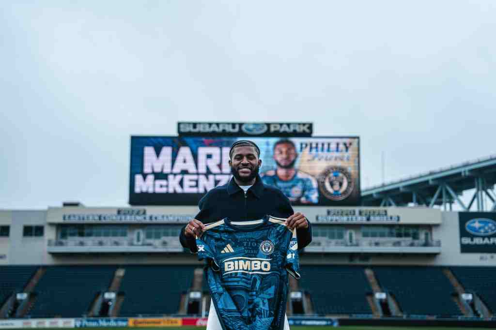
CHESTER, Pa.— The Union’s 2026 third kit is here officially, after being leaked some time ago. The “Philly Kit” was unveiled by the club on Thursday, aiming to bring a retro vibe and represent the city’s sports culture, with the colors of the other major Philadelphia sports teams included alongside Union details. It was one of eight third kits unveiled as part of the adidas MLS Archive Collection for 2026.
Per the Union’s press release:
More than a jersey, the 2026 “Philly Kit” pays tribute to the people, neighborhoods, traditions, and unforgettable moments that have shaped Philadelphia’s sports culture. Designed as a celebration of the city’s rich athletic history, the kit honors the legacy of Philadelphia sports while establishing the Union’s place within it.
Inspired by the defining sports culture of the 1990s, the 2026 “Philly Kit” captures the spirit of an era that helped shape generations of Philadelphia fans. Rather than recreate the past, the design reimagines it, placing the Union alongside the teams, traditions, and memories that have become part of the city’s story.
So now that it is out, and I have seen it in person at Subaru Park and in official photos and not just mid-quality leaked images, it is time to give my honest perspective.
I grew up cheering for all the Philadelphia sports teams, with early memories of Randall Cunningham in the Kelly green and the ’93 Phillies drawing me into the fandom, along with my family’s influence. I remember 90s Philadelphia sports and the vibes, and I like that this is an effort to encapsulate that. Maybe we will not talk about the late 90s Eagles and Phillies, though.
Unlike the other half of this media team, the Philly sports culture has been a constant in my life from as far back as I can remember. With that being said, I love the spirit of the Union’s third kit and the inclusion of the colors of the Eagles, Phillies, Flyers, and Sixers in the kit. I also feel like more could have been done with this.

I think the orange, red, blue, green, and navy stripes on the sleeves and collar are the best parts of the kit. While I am not always a fan of white/light-colored kits, utilizing an off-white jersey makes sense in this case and allows the colors to pop. I also like the Liberty Bell detail with the negative-space snake.
With that being said, we have to talk about the differences between the authentic and replica jerseys. Aside from the price (online it is $170 for blank authentic and $205 with name/number versus $100 for blank replica and $135 with name/number), my favorite aspects of the authentic are missing in the replica.


On the replica, the multi-colored stripes are only found on the collar, and are absent from the sleeves. The Liberty Bell is also missing from the bottom corner, along with the sleeve patches and the texture in the ClimaCool fabric, which looks somewhat snake scale like, breaking up the monotony of the solid coloring. The snake logo on the front looks nice with the embroidering on the authentic, but is just has the ironed-on look on the replica.
It is always refreshing to get a change in the shirt sponsor on the front, and I am sure many females like myself can relate to not being thrilled about the word “Bimbo” across the chest, no matter the actual meaning of that branding. That logo has been moved to the bottom of the back of the jersey, making way for a “Philly” logo with the city’s skyline.

Unfortunately, after hearing it compared to the Fortnite logo, I cannot unsee that. Maybe it is the font that doesn’t do it for me? What would have been great would have been some sort of homage to the Bethlehem Steel (not actually a Philly team, so I get it) or even better, the Philadelphia Atoms of the NASL.
The dual-sided scarf and the hat that both sport the multicolored stripes are nice, and socks are also available with the same motif. In fact, I would say the scarf is the best piece in this collection, though at this moment it does not seem to be available online but can be found in the team store at Subaru Park.
I do like the look of the name and number on the backs of the jerseys. That alone, to me, would justify getting a player/personalized jersey.
When looking at the full kit on the players, I think it looks pretty decent. But unless you are a kid, a player, or a full-kit w— well, you know… then that will not really matter to you, the person who would probably pair it with jeans or some leggings. If I were to buy it, I would have to spring for the authentic though, because the drop-off between it and the replica is, in my opinion, steep—but so is the price tag. If that is not an issue for you, I definitely say go for the authentic.


The Union will don the kits for the first time next Wednesday, August 19, when they host Inter Miami.
What about the other third kits that were unveiled?
Along with the Union, Austin FC, Chicago Fire, Houston Dynamo, CF Montreal, Orlando City, Real Salt Lake, and Vancouver Whitecaps had third kits released yesterday.
Just by the sheer fact that I love that shade of purple, Austin’s “Violet Crown” kit was the hands-down winner to me. Did I know why a team so entrenched in green and called the Verdes went for a stunning purple? No, but it is definitely a jersey I would just wear for the fashion of it. It hit the way the purple goalkeeper kits in 2025 did to me, and reminds me of my gorgeous hydrangeas in the backyard. According to Austin FC, the purple has to do with the sunset, which shows in the purple and pink gradient in the “Austin” across the chest.
I also like Real Salt Lake’s “Black Diamond” kit. Simply put, it is very RSL. I want to like Orlando’s, especially with the nod to their history, but it reminds me of fidget spinners. Any teacher who lived through that craze a few years back akin to today’s NeeDoh/squishy fad knows why I do not want to see a fidget spinner. Montreal’s also has a nice callback to their history as the Impact, and I like the blue details… just something is missing. The others are fine and suit their teams.
To quote one of my favorite movies of all time, 10 Things I Hate About You, “I know you can be overwhelmed, and you can be underwhelmed, but can you ever just be whelmed?” Though technically “whelmed” is a word, and basically means the exact same as “overwhelmed,” for the Union’s kit and most of the other third kits, I am just whelmed if you take it in the sense from the movie quote of being in-between.
To quote 10 Things once more, Bianca Stratford says, “There’s a difference between like and love. I like my Skechers, but I love my Prada backpack.” I like the “Philly” kit, but I love the “Bethlehem Steel” kit. Of course, if the Union have a great victory over Miami wearing the Philly kit, its stock may rise.
*Note: I have not purchased this jersey or other related merchandise, nor have I been given any items or experiences having to do with its release. This is a completely objective, uncompensated review.
Main article photo sourced from the Philadelphia Union and edited by Jillian Almoney.


Leave a comment